A Level- Music Promo Video

I am going to create a music video promoting a "new single" I will use this blog to show all my research and development.

Wednesday 11 May 2011

Significance of Audience Feedback

I felt that Audience feedback was significant as different peoples opinions on what they liked about the video and what needs improving helped me to make any necessary changes to the video to make it better. However it was difficult to obtain any needed improvements as all of my feedback was positive so I didn't feel the need to make any changes as I was happy with the outcome and so was my audience.
I used websites such as Youtube and Facebook to post my video and gain feedback, I found that Facebook worked more effectively than Youtube as the news feed shows everyone you're friends with your posts, I also had a prous family member from The States view my video and then post it on her own news feed for all of her friends to view giving my film more publicity. I found Youtube less helpful as people have to seek out particular films they want to see and if their search does match my film, the order in which they will see them goes by most popular/viewed so my video wouldn't be obvious to see/find.
Here is a screengrab of my audience feedback.


Monday 2 May 2011

How did you use new media technologies in the construction, research, planning and evaluation stages?

I created my film using a Digital Nikon Coolpix p80 digital camera, it has 10.1 mega pixels, ISO of 6400 and an 18X optical zoom. A MacBook laptop and the iMovie editing program and edited photos for my poster and digipack using Photoshop Elements 6.


My film was quite simple to make but without the editing software or the quality camera it would not have had the same standard as the clips of stop motion needed to be linked together smoothly, I filmed my stop motion by pausing the recording rather than piecing stills together I felt it came out alot more smoothly than my trial runs of still stop motion, However this did mean that alot of my clips had to have time adjustments to keep them in time with the music and vocals by either speeding up or slowing them down.


I used the turtle/hare selection bar to turn up or turn down the speed if the clip.

 Also the picture quality would not be as high as I used a good camera and I used imovie to adjust the picture, turning up exposure and contrast to make the writing bold and clear as this was an important element of the video, I also saturated the picture slightly and turned up color temperature for an edgy dated style.


Here you can see where I have moved the exposure and contrast up and saturation down.

Also the internet came in highly useful as I had to use the artists, producer and record label's websites in order to contact them for copyright permission. I also used Facebook to broadcast clips and photos for feedback and a song vote. I also broadcasted my final video to Youtube and linked it to Facebook in order to get some audience feedback. 
I didnt need to use alot of equipment or software for the making of my film as it was quite simplistic and easy to make, I am happy with the final outcome I think it was sucessful, there are a few moments in the film that are a little bit slow that I wouldve changed if i had more time but overall it came out well. 

How effective is the combination of your main product and ancillary texts?

I feel that the combination of my Music Video, Promotional Poster and Album Digi-Pack wok together effectively as they all hold the same theme of paper scraps and handwriting and have been edited to match up.
My music video follows the lyrics of the song with writing and actions, it doesn't appear to have a clear acted narrative, band playing or even an artist shown like most music videos do, I felt the focus should be on the song and the meaning behind the lyrics, I gave my video an underlined narrative of closure as the song Skinny Love is about a failing, broken relationship. I used torn up notes to portray a bitter end to a relationship, the way they've been torn up and burnt give closure to whomever is doing so. I gave my video a edgy vintage style by using brightness and contrast to make things bold, as it was based on writing I had to make sure it was dark and clear to stand out. I also turned the saturation down a tiny bit after turning the color temperature up for a burnt effect to make it look dated. I think my video challenges the conventions of typical Music videos by focusing on meanings and lyrics in a more abstract unclear way.
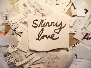
My poster is an image from the video, with the artist and song name added in. The editing is the same as the film, high brightness and contrast with a slight saturation and color temperature turned up for a burnt yet dated style. This works well as part of the package because it it clearly matched to the other products, you wouldn't even have to read the poster to know it goes with the Music video, Same method goes for my Digi pack as the album art matches the poster along with a heart drawing from the music video (gets cut up) on the inside left, Scrap papers with the lyrics written on them for the inside right, and for the back cover and tracklist the pieces are lined up with the song names handwritten on them, burnt edges on the pieces to match the narrative of the video. Same method of editing as the video and poster.
To conclude I definitely feel the combination is effective, they all match with similar imagery and editing so audiences will know the theme and recognize it for Skinny love.

In what ways does your media product use, develop or challenge forms and conventions of real media products?

I have taken 9 distinct screen grabs from my Music Video to annotate and discuss.

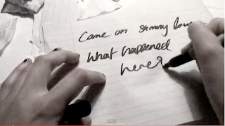
1. This image is the opening titles for the video, it establishes the song, the artist and the producer (me). This isnt something that is typically used in mainstream music videos as they are usually more about the artist/performer. I created my opening using stop motion, keeping the camera still on a tripod and pausing the recording in between moving the paper, I used this method over stills as it had more of a flow and was easier to edit.
2. This image Basically opens the video, the image matches the lyrics of the song and appear in timing with stop motion, a theme that runs throughout my video. I used the same method of stop motion as in my introduction.
3. This image is an action that matches the lyrics and narrative at this particular part of the song "cut out all the ropes and let me fall" the scissors cutting the heart match with the idea of cutting someone away, letting go. I didn't use stop motion for this clip but it was sped up in editing to keep timing and make it look more edgy.
4. This image is the chorus sequence, I decided to portray the chorus with words rather than image. Challenging the typical conventions of most mainstream music videos. I used stop motion for this clip.
5. This image is a match on lyric again, I write out the words as they are sung, I felt this was timed really well and looked effective, matched in with the handwritten theme of my work. This clip was sped up in editing to keep in time.
6. This image is of the paper blowing away, something I used inbetween verses to create a blank canvas image, starting anew with every different verse. This clip was slowed down in editing to enhance the fluttering of the paper.
7. This is another image of the words being written as they are sung, timed well and effectively, a constant theme throughout the video, I am using destroyed love letters and writing notes to create the narrative for the song as it is about a failed relationship, my video portrays personal closure. This clip was sped up in editing .
8. This image is all of the scraps throughout the video piled back up, shows the story as a whole, as a big pile of mess to abstractly match the narrative. This clip was slowed down so you can see all the paper falling down i felt it was more effective than the raw clip.
9. This image is the notes being burnt, destroyed. The end of a chapter. I used a lighter fluid to make the flames spread quicker through the pile of paper, I didn't need to speed or slow this in editing.

Now I will take 9 screen grabs from other music videos from the same genre and analyse them as i have done with my own product.

1. This is a clip from Laura Marlings "New Romantic", this video is similar to mine in the sense that it uses words and images that match the song as it plays, it is a very simple video with the artist either sitting or standing singing and playing an acoustic guitar, lighting is important in this video as everything is shown by shadow and silhouette, there is a spotlight on laura and the wall behind her, the cinematography is simple leaving the focus on the moving shadows.

2. This is a clip from Fleet Foxes "Mykonos" I found this video similar to mine as it uses little pieces of paper layered and animated to show the narrative, the pieces are put together to make little oregano style characters. 

3. This is a clip from Iron and Wine "Naked as we Came" I found this video effective as the narrative is shown more abstractly starting with dead fish in the bowl, slowly moving along a long table full of food and ornaments, to children stood at the end, they run away and the camera tracks back down the table to the fish alive in the bowl. It is alot more creative and thougt provoking.

4. This is a clip from Mumford and Sons "The Cave" I chose this clip as it has been slowed down to show the glare of light as it grows brighter, much like the idea in my video as i slowed down the paper to enhance the image of it fluttering away. Also the editing of this video has been saturated for a vintage faded style.

5. This is a clip from Birdy "Skinny love" she is a new artist who has sung a cover of Bon Ivers Skinny Love. I liked this part of the video as it has been slowed as she brushes leaves from her hair, the video is also saturated and has a vintage theme throuhout with imagery, costume and the editing. Lighting is key in this as many clips are either getting brighter or getting darker, it doesnt portray much of a clear narrative.

6. Ellie Gouldings "Guns and Horses" I really like the way this clip uses smoke to give this hazy dark feel to it, it has been saturated to keep in with this dark misty forest theme. I feel that this image matches lyric too as this character appears with the words "you found me" and the imagery used in the video match the song with soldiers and a horse.


7,8. Panic at the Disco "Northern Downpour" I found this video was very similar to mine as it didnt hold a blatant narative and everything was shown by the lyrics, sentances and words from the song shown anywhere and everywhere, however the artists are shown too playing and singing so it promotes the band and the song effectively. I also liked how it is black and white and their costumes are dated and they are in the countryside as it contrasts with the modern city where all the lyrics are shown. 

9. Lykke Li "Little bit" I found this video was effective and quite abstract as it shows lykke li dancing her way slowly through rooms with a bright ligh behind her all the way, the editing has made the video very choppy as it cuts from standing to dancing or it cuts to people behind her moving around for example this piano player in the background, it switches between him and lykke li as he manicly plays. I like how theres no clear narrative its artistic and matches the music with movement.

Friday 29 April 2011

Bon Iver's Skinny Love Music Promo Video Finished Product

My Poster Design


I chose this image as my poster design as it is basically an image from my film with the artists name and song shown clearly. I have also thought about using this image as my album cover for the Digi pack so that the two match up. I couldn't really find anything similar to this in my research to compare with but I feel that all posters are different when it comes to folk as most are drawn or painted then printed to be put up around towns and venues, I also felt that changing my poster to a gig/performance poster would fit into the conventions of a promotional poster alot more. It was one of two choices for the poster this is the design of the other poster I made, but felt was less effective as it didn't hold the artist name.

Research- Posters

As part of the promotion to go along with the Main music video "Skinny Love" I am required to create a Poster design for artist Bon Iver. Below I have found some examples of promotional posters for Folk artists  I have looked at in earlier research.


I picked these examples from Bon Iver as the handdrawn style of them match the theme idea for my own work. I also picked an example from Noah and The Whale as it is also an image/drawing rather than a photograph. I think the simplistic style works nicely as it looks more creative and fits in with the conventions of Folk. 


These two examples from Laura Marling and Mumford and Sons are less like what I would like to use in my work as they are Photographs and also they are Gig posters, they hold more text on them. However I still think these posters are effective as they are promototing the artist and the way the photos have been edited they seem dated, particuarly Mumford and Sons photo, it has been filtered and saturated to give a vintage style. I also prefer the text used it it more like a book title font.