A Level- Music Promo Video
I am going to create a music video promoting a "new single" I will use this blog to show all my research and development.
Friday, 29 April 2011
My Poster Design
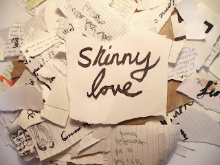
I chose this image as my poster design as it is basically an image from my film with the artists name and song shown clearly. I have also thought about using this image as my album cover for the Digi pack so that the two match up. I couldn't really find anything similar to this in my research to compare with but I feel that all posters are different when it comes to folk as most are drawn or painted then printed to be put up around towns and venues, I also felt that changing my poster to a gig/performance poster would fit into the conventions of a promotional poster alot more. It was one of two choices for the poster this is the design of the other poster I made, but felt was less effective as it didn't hold the artist name.
Research- Posters
As part of the promotion to go along with the Main music video "Skinny Love" I am required to create a Poster design for artist Bon Iver. Below I have found some examples of promotional posters for Folk artists I have looked at in earlier research.
I picked these examples from Bon Iver as the handdrawn style of them match the theme idea for my own work. I also picked an example from Noah and The Whale as it is also an image/drawing rather than a photograph. I think the simplistic style works nicely as it looks more creative and fits in with the conventions of Folk.
These two examples from Laura Marling and Mumford and Sons are less like what I would like to use in my work as they are Photographs and also they are Gig posters, they hold more text on them. However I still think these posters are effective as they are promototing the artist and the way the photos have been edited they seem dated, particuarly Mumford and Sons photo, it has been filtered and saturated to give a vintage style. I also prefer the text used it it more like a book title font.
Thursday, 28 April 2011
Digi pack Design- Album Art
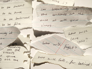
This is the design I have chosen for my Digi Pack. It goes with the theme of my film having the ripped up paper and projector images. The album art clearly shows the Artist and Song name, the Tracklist and the Lyrics to the song.
Sunday, 3 April 2011
Inspiration- BBC Film Network- Eulogy For Things Left Unsaid
I found this browsing for some more/new inspiration for my music promo video I really liked the imagery used as I am planning to try to avoid using people in my filming and portraying my narrative via objects, scenery's, stop motions and light manipulations for a more abstract and artistic product.
Subscribe to:
Posts (Atom)


